Đây có thể coi gần như là 1 bài lưu cho riêng cá nhân. 1 bài để lưu lại tất cả những thứ nhảm nhí mình làm, những câu hỏi ngớ ngẩn mình post lên một diễn đàn thiết kế trên linkedin, để rồi mình thấy bản thân may mắn khi được ai đó dành thời đưa ra những góp ý tích cực giúp mình có động lực tiếp tục mài dũa kĩ năng và tự tìm hiểu để chia sẻ điều gì đó với mọi người.
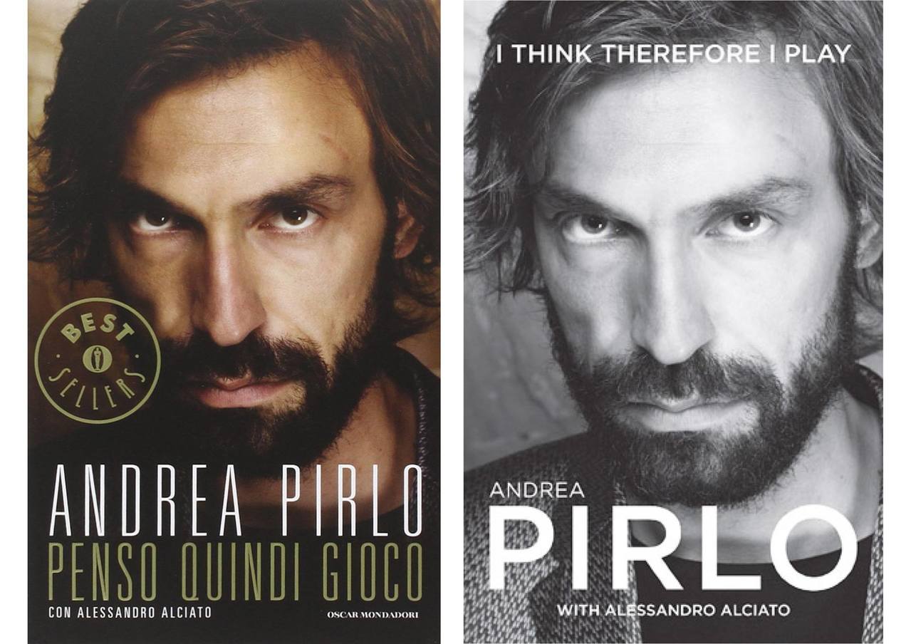
1. Bìa sách Andrea Pirlo
Câu hỏi:
Question about typeface in particular example
Hello everybody
Thank you for your opinions that you commented in my topic:
Especially, thanks to Philip Nice, who even created a new topic that extends mine.
In this topic, I want to learn more about typeface in particulare circumstance. The example is the autobiography of Andrea Pirlo. The left one is Italian version, The right on is English version.
The book cover is very simple, his face is zoomed in and typography. I think this is a good example of using typography :).
- The left one: Colourful image, strong, sharp eye with bold ginger beard bring me feeling of some kinds of Sparta, a strong, an experienced life. The used type is very narrow and tall, has very thin stroke and it does not bring me the feeling of strong, experienced of the eye and that beard that do. I wonder that the design do that to make the contrast that make image more impressive ?
- The right one: Black and white image, less strong, sorfer than the left one. I do not know the typeface used here. It is similar to Avenir. The font is geometric, direct, strong enough and has medium stroke that ,I think, harmonizes more with the image . I wonder small cap "ANDREA" is suitable? Because Andrea Pirlo is full name of a person.
=> I prefer the left picture, but if to choose a more suitable design, I think I would choose right one.
"Love your design sensitivity; thanks for this post. Intuitively, I prefer the colored one.
Image: As you put it, strong/sharp eye/ginger beard/Sparta/strong experienced life/impressive. Interesting in this case how color (and the contrast and texture that go with it) achieve all that. The black & white version, which has lost the contrast, feels soft and weak in comparison.
Typeface: To my eye, one skinny letter may not be “strong,” but together the setting feels rich, towering, theatrical. I like that his full name is there; it honors him. The setting feels designed and intentional and could easily stand alone. It focuses all your attention in one rectangular place — words here, picture there. Very strong. (I would tighten, slightly, the gap between his names.)
The black & white typeface, on the other hand, is common. Gotham, good as it is, is used for everything from signboards to text to tissue boxes, which is part of its problem . . .
. . . Bold may have worked, but the light weight feels hollow; there are big spaces in and around the characters. His tiny first name looks like an afterthought, ironic since in Italy where he’s famous his last name alone would be enough, but in the English-speaking world not so much.
Words are scattered around the page, too — here, there, mostly centered but not all — so the layout is weak. (Imagine removing both photos and looking at the words alone.)
My sole reservation is that the colored design brings to mind a movie — the super-condensed typeface is iconic cinema — perhaps music, perhaps theater, not a book by a soccer player. That said, I’d still choose it."
John McWade.
2. Thứ nhảm nhí
Feedback:
Hi Bui Manh! First impression is that this does not feel like street food. The images are too posed, too slick, the line too geometric and structured. Street food is informal, gritty, earthy; it’s about people and atmosphere and place. Food is steamy, tangy, unexpected; you can see it, smell it, feel it; there’s chatter and conviviality; you could stretch it to say there’s even a romance in it, often a rush, a bustle, so on.
All of which is missing in your neat, sterile photos. Your type is closer to the experience — ragged, unruly, hand-drawn. But I don’t love the uppercase HA NOI — the letters don’t fit well — and the chopsticks feel only like they’re filling space.
So I’d suggest starting over. Ditch everything here and see what you can do to capture the mood of the street.
John McWade
3. Thử nghiệm làm lại poster theo phong cách Massimo Vignelli Bản mình làm bên trái, bản gốc bên phải
"1) Note all Vignelli’s stuff has BIG variations in type size — SKYLINE is huge, separated by a quarter-page of white space (small text within), followed by three segments with bold-line dividers filling the bottom half page.
Your version, on the other hand, is more uniform — fairly small head, and somewhat smaller numbered heads between the bold lines. So you lose the drama of huge>white space>segments.
2) Two, your six segments instead of three turn the design into a page of horizontal stripes. The bold lines are stripes, the long headlines are stripes, and the white space between segments are also stripes. So it feels much different. And beneath your MASSIMO VIGNELLI header, you’ve centered (more or less) the small text in the white space, which “deactivates” the white — basically evens it out so it loses energy. Vignelli’s placement is more dynamic. Even dividing your copy into three columns would improve it."
" From the original poster, the vibe I get is a cluttered, all-purpose, department store (which aligns with my retail experience). The name of the store was cropped out in the video, but the images do not convey any sense of brand awareness or intention. They appear to be floor shots from the (likely) crowded store. (I tend to get claustrophobic in establishments like this.) A budget conscious brand seems more likely to use the poster array approach in the attempt to get as much bang for their buck as possible, but in the long term, it could prove counter productive in that it negatively affects recall and doesn't drive an emotional connection between customer and brand. While I understand and value your approach in this video, pulling a single item out and presenting it aesthetically violates the spirit of what you were comparing it to. The original advert seems to be from a home store, and having worked retail for many years when I was younger, sometimes real-world adverts such as this are intended to provide walk in customers a snapshot of current sales specials. Your reworked concept would be useful as an aisle display where the particular item is located on the sales floor, but unless someone were to walk past that section, they might never know the item was on sale. The gaudy poster was to signal to customers at the door, "Hey, you may be here looking for furniture, but we have fountains on sale too!" ".
Robert W. Williams
After reading the comment, I have to reconsider the problem here:
Clutter design: " Hey, I am selling everything here with sale off benefits"
Elegant design: " I present this style with the product here, you want to be stylish ?
Maybe, in this case, elegant design is not a good choice. But can I make a elegant clutter design ?
- How do you explain why designs work so easily or look easy ?
- How do you practice explaining design? And at the beginning, how do you know your explaination right or wrong?
- Have you ever met a design that you feel difficult to explain ? What do you do to explain that ?
Awnser:
"These are really hard questions to answer.
I was 20 years into my career before I even attempted to explain design, so by then I had a pretty deep well of general principles and techniques that work and don’t, plus broad context, which is always the wild card — a layout that “works” in context A will not work in context B, and so on.
As for what works, that’s all eye. Does it appeal to you and others? Is it beautiful, simple, clear? Does it have qualities in common with other things that look good? — alignment, scale, contrast, and so on. What message is it making within its context?
As for ever meeting design that’s difficult to explain, I’d say every design is difficult to explain. Most, actually, are impossible, at least for me. Many designs are gorgeous but so unique they can’t be duplicated and will work in no other context. In these cases, I might focus on just a detail or two for you to think about . . .
. . . Generally speaking, I’ve always felt that if my instruction were a college course, it would be second-year level. I stay with the basics, which are the building blocks of all design. For example, I can show various kinds of contrast (big-small, many-few, etc.) and some examples, and I can show you how I applied them in this case, but the rest is up to you.
How do I know my explanation is right? Ha! Always scary. I spend a lot of time behind the scenes trying to prove or disprove it. This often takes the form of creating a design, then changing its words and pictures. Does it still work? If so, why? If not, why not? And I’m often surprised. I’ve expected something to fail that clearly succeeds, and vice-versa.
They say the best way to learn is to teach. Mine has been a one-of-a-kind education, and fantastic."
PS: Kết quả của những ý kiến xây dựng trên và những thử nghiệm mình làm: